



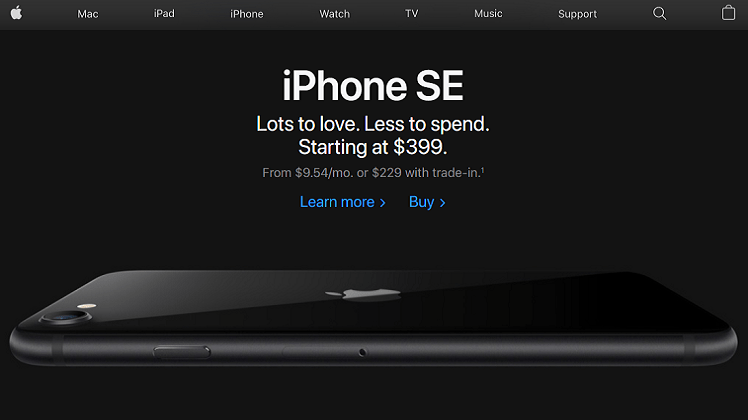
Originally published: Jun 26, 2020. Last updated: Oct 11, 2026.
One of the most common requests designers hear from clients is simple: “We want a website like Apple’s.” Apple.com has set the standard for premium web design for over a decade, and that request is really a compliment to restraint: generous white space, confident typography, photography that does the selling, and pages that load fast and work for everyone.
Here is the good news. You do not need Apple’s budget or Apple’s brand to borrow what makes their website work. The principles behind it are public, practical, and well within reach of a small business in 2026. This guide breaks down what Apple’s website actually does right today, how to apply each principle on a realistic budget, which platforms make it easiest, and what you should deliberately not copy.
What Apple’s Website Actually Does Right in 2026
Apple’s site is not impressive because it is complicated. It is impressive because almost nothing on it competes for your attention except the product. Five principles do most of the work.
1. Restraint is a system, not a style
Open Apple’s own website and notice what is missing: no borders, no gradients shouting for attention, no decorative frames, no shadows on headlines. The page is a stack of full-width product tiles that alternate between white and near-black, and the color change itself acts as the section divider. One quiet blue carries every link and button. The typeface (Apple’s SF Pro family) uses tight letter spacing at large sizes, which gives headlines their calm confidence.
Each tile gets roughly one screen of space and one idea: a hero headline, a one-line tagline, and at most two small calls to action. Nothing else competes. For a small business, the lesson is not “use white backgrounds.” It is: give every section one job, and remove everything that does not serve that job.
2. Product storytelling, not spec sheets
Apple rarely leads with specifications. It leads with what the product lets you do, told in a short scroll: a bold claim, a cinematic product shot, a line of plain-language explanation, then the details for those who want them. Comparison tables appear only after the story has done its work, and “Learn more” links progressively disclose depth instead of dumping it on the homepage.
A small business can use the same structure on a services page or product page: headline with the outcome, one strong image, three short benefit blocks, then the detailed specifications or process steps for visitors who scroll. Story first, specs second.
3. Performance is part of the design
A premium-looking site that loads slowly does not feel premium. Google’s Core Web Vitals remain the public bar for page experience in 2026: Largest Contentful Paint under 2.5 seconds, Interaction to Next Paint under 200 milliseconds, and Cumulative Layout Shift under 0.1, measured at the 75th percentile of real visits. Interaction to Next Paint replaced First Input Delay back in March 2024, and it is the metric most image-heavy sites still fail, because it measures responsiveness across the whole visit, not just the first click. A clear Core Web Vitals guide for 2026 walks through what changed and how to fix each metric.
Apple’s pages are fast because they are disciplined: optimized imagery, minimal third-party scripts, and nothing render-blocking above the fold. Your small business site needs the same discipline more than it needs the same budget.
4. Accessibility is a default, not a feature
Apple’s interfaces are famous for working with screen readers, keyboard navigation, and reduced-motion settings, and the legal world has caught up with that expectation. WCAG 2.2 is now the global benchmark: it became an ISO standard (ISO/IEC 40500:2025) in October 2025, and the European Accessibility Act has been in enforcement since June 28, 2025, applying to businesses that sell to consumers in the EU. WCAG 2.2 added practical requirements such as minimum 24 by 24 pixel touch targets, focus indicators that are never hidden behind sticky headers, and login flows that do not rely on puzzles. A 2026 overview of accessibility standards summarizes what changed.
You do not need a legal team to start. You need sufficient color contrast, real text instead of text baked into images, descriptive alt text, keyboard-operable menus, and captions on video. Accessibility and Apple-like polish are the same project: both remove friction between the visitor and the message.
5. One screen, one job
Apple’s top navigation stays short even though the company sells dozens of products. Each product tile offers at most two actions. The discipline is deliberate: a visitor should never wonder what to do next. Apply the same rule ruthlessly: keep your main navigation to seven or fewer items, give every page one primary call to action, and let secondary links live in the footer. If you are rethinking how your pages connect, our guide to website structure and its types explains the common patterns.
How a Small Business Applies These Principles in 2026
Principles are only useful if they turn into decisions. Here is how each one translates to a small business website built this year.
Start with the story, not the template
Before choosing colors or a theme, write your homepage as five sentences: who the site is for, what outcome you deliver, why you are credible, what makes you different, and what the visitor should do next. Those five sentences become your hero headline, subheading, trust signals, differentiator section, and call to action. Templates are easy to change later; a muddled message is not.
Build a restrained visual system
Pick a type scale with three sizes (display, heading, body), one or two brand colors plus neutrals, and a single button style used everywhere. System fonts or a clean Google Fonts pairing will carry you surprisingly far; what reads as “premium” is consistency, not an expensive typeface. Document the choices in a one-page style guide so every new page, blog post, and landing page matches.
Treat photography like your product
Apple uses fewer images than most sites, but every one is exceptional. You can apply the practical version of that idea: invest in a half-day shoot of your real product, team, or space instead of filling pages with stock photos, then optimize every image (modern formats like WebP or AVIF, responsive sizes, explicit width and height attributes, descriptive alt text). Real photos also build the trust that stock cannot. For the technical side, see our guide to optimizing your images for visual search.
Follow the 2026 performance checklist
Run your key pages through PageSpeed Insights and check the field data, not just the lab score. Then work this list:
- Compress hero and product images and serve them in WebP or AVIF with responsive sizes.
- Lazy-load everything below the fold; preload only the hero image.
- Keep plugins and third-party scripts to the minimum (each chat widget, popup, and tracker costs speed).
- Use caching and a content delivery network so repeat visits and distant visitors stay fast.
- Hit the published bars: LCP under 2.5 seconds, INP under 200 milliseconds, CLS under 0.1 for at least 75 percent of real visits.
Cover the accessibility basics
- Body text contrast of at least 4.5 to 1 against its background (WCAG AA).
- Every interactive element reachable and operable by keyboard, with a visible focus indicator.
- Touch targets at least 24 by 24 pixels, larger on mobile.
- Descriptive alt text on informative images; empty alt on decorative ones.
- Captions or transcripts for video and audio content.
- An accessibility statement page describing your commitment and a contact for issues.
Nail the essentials before the flourishes
An Apple-like aesthetic cannot rescue a site that is missing the basics: clear contact information, service descriptions, pricing or a way to request it, testimonials, and a fast mobile experience. Make sure you have the essential elements every small business website needs in place first, then apply the polish. Restraint amplifies a complete site; it exposes an incomplete one.
Choosing the Right Platform in 2026
The platform you build on determines how much of this you can do without a developer. Recent hands-on builder comparisons broadly agree on the landscape; here is the short version for an Apple-inspired build (prices approximate, as of October 2026):
| Platform | Best for | Starting price | Watch out for |
|---|---|---|---|
| WordPress (self-hosted) | Content-heavy sites, full ownership, blogging for SEO | Free software plus hosting | Maintenance and plugin sprawl can erode speed |
| Webflow | Design-led marketing sites with precise visual control | Around $14/month | Steeper learning curve; see this in-depth Webflow review |
| Framer | Fast, modern landing pages and portfolios | Free tier; paid from around $5-10/month | Thinner CMS for large content libraries |
| Squarespace | Polished templates with minimal setup | Around $16/month | Customization ceiling as you grow |
| Wix / Shopify | Wix for flexible general sites; Shopify for serious ecommerce | Around $17/month / $29-39/month | App and theme bloat needs active management |
Whichever you choose, the Apple principles do not change: fewer, better images; a restrained type and color system; one job per page; and speed and accessibility treated as design requirements from day one.
Turn the Polish into Leads
A beautiful site that generates no inquiries is an expensive brochure. Apple’s minimalism works because every tile still ends in an action: learn more, buy, compare, find a store. Your version of that is a clear primary call to action on every page, short forms, visible social proof near the action, and a follow-up path (email list, quote request, booking link) for visitors who are not ready to buy today. Pair the aesthetic with the design elements that turn visitors into leads, and once the site is live, make it findable: technical SEO plus a steady effort to earn quality backlinks is what puts a polished site in front of people.
The Apple-Inspired Website Checklist (2026)
- One clear message and one primary call to action per page
- Navigation limited to seven or fewer top-level items
- A restrained type scale: three sizes, one family, consistent weights
- One or two brand colors plus neutrals; a single button style everywhere
- Real photography, optimized in WebP or AVIF with descriptive alt text
- LCP under 2.5s, INP under 200ms, CLS under 0.1 for most real visits
- WCAG 2.2 AA basics: contrast, keyboard access, visible focus, captions
- Mobile-first layout with 24px-plus touch targets
- Contact details, pricing path, testimonials, and policies easy to find
- Analytics and Search Console connected from launch day
What Not to Copy from Apple
Imitation has limits, and knowing them keeps you out of trouble:
- Do not copy the sparse copy. Apple ranks on brand authority; you rank on relevance. Your pages still need enough descriptive text for search engines and first-time visitors to understand what you offer.
- Do not hide the practical details. Minimalism should never bury your phone number, address, hours, pricing, or policies. Local and service businesses win on findability, not mystery.
- Do not ship heavy scroll-jacking animations. Cinematic scroll effects are expensive in performance and often hostile to keyboard and screen-reader users. Use motion sparingly, keep it quick, and respect reduced-motion settings.
- Do not fake the photography. If you cannot produce studio-grade product renders, use honest, well-lit real photos. Visitors forgive modest photography; they do not forgive feeling misled.
- Do not skip the footer. Privacy policy, terms, accessibility statement, and sitemap links belong on every page. Apple has them too; they are just quiet about it.
Frequently Asked Questions
Can a small business really build a website like Apple’s?
Yes, in the ways that matter. You can copy Apple’s principles: restraint, clear typography, strong photography, fast performance, and accessibility. You cannot copy their brand equity or their production budget, and you should not try. Aim for the feeling of calm confidence, built with modern platforms and disciplined choices.
What is the single most important Apple design principle to copy?
Give every screen one job. Apple’s pages succeed because each section has a single headline, a single idea, and at most two calls to action. If you apply only one principle, make it this one: remove everything that does not serve the page’s primary goal.
Which website builder is best for an Apple-style website in 2026?
It depends on your skills and content needs. Webflow offers the most precise design control, Framer is fastest for polished landing pages, Squarespace gets a clean site live with minimal effort, and self-hosted WordPress gives full ownership for content-heavy sites. Choose based on who will maintain the site, not just who builds it.
How much does an Apple-inspired small business website cost?
A disciplined DIY build on a modern platform can cost little more than hosting and a domain plus your time, while a professionally designed small business site typically runs from a few hundred to a few thousand dollars depending on pages, photography, and custom work. The Apple look itself adds no mandatory cost; restraint is free, and speed optimizations are mostly labor.
Does minimalist web design hurt SEO?
Not if it is done right. Minimalist design helps the ranking factors Google measures publicly, especially page experience and Core Web Vitals. What hurts SEO is minimalist copy: keep enough descriptive text, proper headings, and metadata so search engines understand each page. Pair the clean design with solid on-page SEO and link earning.
How do I make a minimalist website accessible?
Follow the WCAG 2.2 AA basics: body text contrast of at least 4.5 to 1, keyboard-operable navigation with visible focus, touch targets of at least 24 by 24 pixels, descriptive alt text, and captions on video. Test with a keyboard alone and a free screen reader before launch, and publish an accessibility statement.
